An A11y Testing Tool Primer
November 20, 2018
Welcome to my funemployment blog series. It’ll probably include new posts about the joys of Kombucha brewing, but for today I’m talking about the process of refactoring my website from Jekyll to Gatsby, and making some much needed a11y updates.
For my little ~5 page website, I used a few different tools different from what I normally use when building apps(Pa11y).
Axe
Axe is an a11y testing tool that packs a serious punch. I love using the Chrome extension for doing quick audits via the browser, and it’s a great tool for when you’re not neck-deep in the codebase. It’s really simple to use, just download the browser extension of your choice, navigate to your dev tools and click the “axe” tab, and then hit “ANALYZE”.
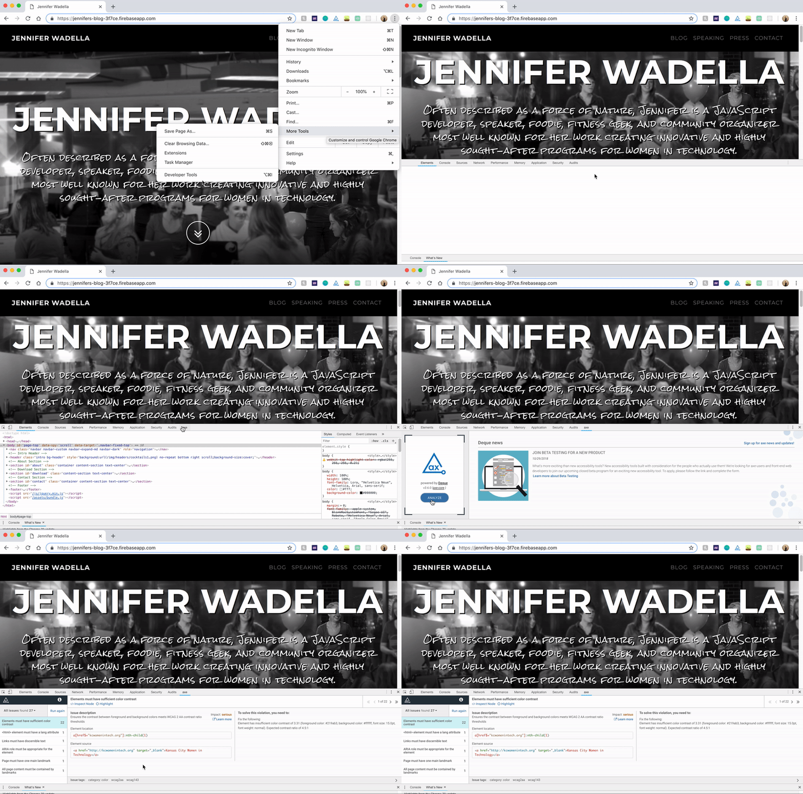
Here I’ve run Axe against the index page of my blog before I fixed all the issues. It lists out all my accessibility issues and allows me to click into where they live in my markup and includes suggestions on how to fix them. 27 issues, yikes!
- First up - ‘Elements must have sufficient color contrast’. This doesn’t like the contrast between my link colors(#219ab3) and the page background(#ffffff) - 3.31 when we want 4.5:1(or higher).
Luckily this is easy to fix. I can use WebAims contrast checker to figure out what color hex I need to change to by dragging the slider. Looks like #1B8193 will give a contrast ratio of 4.56:1, woooo. Next!
- <html> element must have a lang attribute. Herp derp, Jennifer, sometimes you forget HTML basics. This is easy enough to edit now that I have the hang of React Helmet.
<Helmet
  htmlAttributes={{ lang: 'en' }}
  meta={[{ name: 'description', content: siteDescription },
        { name: 'keywords', content: siteKeywords}]}
  title={siteTitle}
/>- *Links must have discernible text. It’s easy to forget about silly little icons that act as anchors, so I love that Axe caught this and reminded me to add an aria-label to explain what the arrow is doing.
<DownArrow href="#about" aria-label="about Jennifer">
    <FaAngleDoubleDown />
</DownArrow>- The remaining issues are related to landmarks. You can read all about landmarks and how to use them here, but they help screen readers better navigate content by being able to discern between nav elements, main content areas, and sidenavs.
Lighthouse
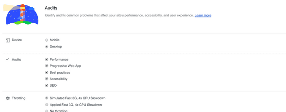
As this is my first time developing with Gatsby/React, it’s safe to assume I’ve done something dumb while learning. I decided to explore my page performance to spot any issues, and maybe any more accessibility mistakes I make along the way. (These screencasts are from my previous website version in Jekyll which I threw up in a hurry and didn’t GAF about optimizing). Lighthouse is an open-source tool readily available in Chrome dev tools. Lighthouse offers a variety of options to choose from:
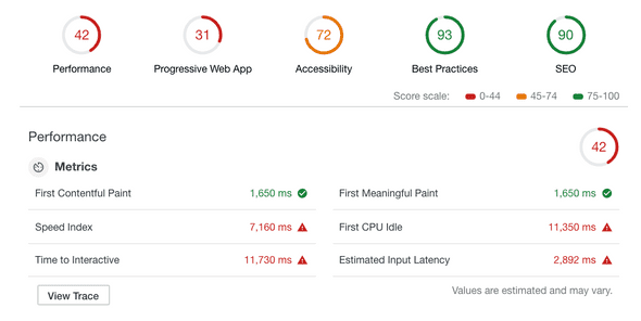
I went ahead and ran all tests because I was interested in performance as well as a11y issues, which can take some time, mine was around ~50 seconds.
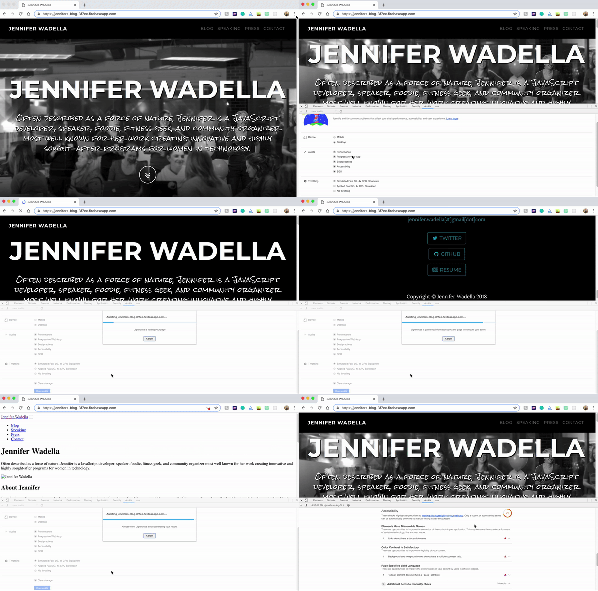
Eep, not great, my performance is craptastic. (Don’t worry, when I redid the site in Gatsby those performance issues were decimated muahahahaha) My SEO isn’t too bad though, which is probably why I have some awesome impressions from search queries like “bitch love salsa” which I’m oddly proud of. (click here for my salsa verde recipe)
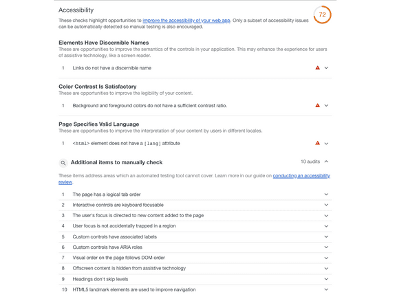
Hokay, focus on accessibility, Jennifer. As a reminder this was run on the same version on my website as the Axe example. It caught all of the previous issues Axe did, though it lacks the nice explanations and ability to click into offending elements, but it did put some new things on my radar.
Let’s focus on the second one - Interactive controls are keyboard focusable. If you’ve never taken the time to consider how those who have impairments use websites, it’s a great time to explore. Lighthouse points us to some useful docs on reviewing sites for accessibility by using just the keyboard for navigation.
https://developers.google.com/web/fundamentals/accessibility/how-to-review#start_with_the_keyboard
Truthfully, everything listed under the “Additional Items to Manually Check” section is worth looking into, like reminders about modals pulling page focus, and checking that headings don’t skip levels. I know I’m not the only one who’s been too lazy to write CSS and instead switched H2s and H3s for styling convenience ;)
Pa11y
Pa11y is my favorite accessibility tool for production. There’s both CLI and scripted usage, but the scripted usage is what makes it great for integrating into your testing/prod setup. I also love the ability to build dashboard reports cause who doesn’t love dashboards??? But in practicality, the dashboards are great for getting reluctant team members or product people on board with getting a11y work into sprint plans.
I’ll dev into Pa11y usage in a separate post, but here’s a quick look at using the CLI for a quick test.

You’ll notice we only see two errors outputting, and it’s not because the rest of my code is flawless. Find out why in my next post!

